Hey there! You may have noticed that some things changed around here. I’m currently messing around with a revamped design and trying to make the site a bit more modern. Hopefully you’ll find the reading experience a lot better with this version. I’m still neck-deep in the code so there are still plenty of things that aren’t perfect yet, but I wanted to launch it early and get some feedback.
In preparation for more editorial-style posts, I’ve made images, captions, quotes, and all that kind of stuff a lot prettier. The site is also retina-ready for the first time, so if you’re browsing from a newer iPhone, iPad, or Retina Macbook, everything will look a little sharper.
Admittedly, I haven’t even tested the site in Internet Explorer yet, and I probably won’t. IE 9 should display everything just fine, and if Google doesn’t support IE 8 and below, I don’t think I should have to either.
Boring Web-Head Jargon
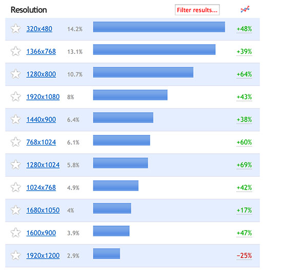
I’d been wondering if it was time to expand the site and make it better-suited for large displays, and my web statistics finally made me feel comfortable doing that. Over the past 90 days, here are the most popular screen resolutions of you all that have visited the ‘squatch.

Science!
A surprising number of you are viewing the site on iPhones, so I’m going to make sure it looks great there. I have a lot of tweaking left to do on the responsive side of things, but I’ve got a good start. I plan on adding a lot of special formatting for things like reviews and videos, so stay tuned.
Let me know if you run across any weird bugs. Right now the biggest is that most of our old posts need updated banner images. I’m working on it. And now, back to your regularly-scheduled geek stuff!
-
Cody Mix
-
ShezCrafti
-
ShezCrafti
-
Tommy Day
-
-