Book Review: World War Z – The Art of the Film
Posted 7 years ago by Rob Lammle Books
If you look at my writing resume here on Top Hat Sasquatch, you’ll find quite a few Art of… books from Titan Publishing. While Titan does an excellent job producing these titles, they have generally followed a fairly standard format: foreward by someone famous, the designs of the main characters, then the supporting characters, the sets and props, and then it wraps up with some technical jargon on special effects, with the occasional paragraph of text from the director, the stars, the set designer, the producers, and lead animators scattered throughout. It’s a bit by-the-book, but the format works.
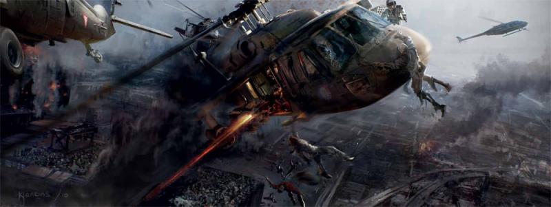
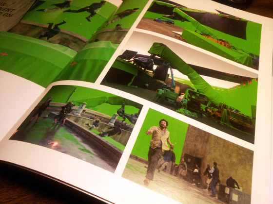
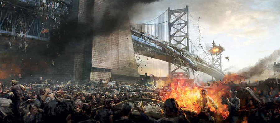
So when I received The Art of World War Z in the mail, I expected the same by-the-book production. But I was surprised to find that they’ve changed things up by making it a complete screenplay with concept art and storyboards that are relevant to the scenes in that section of the script. So, for example, while you’re reading scenes of the military battling hordes of zombies in Philadelphia, you see storyboards of those sequences that were used for the film. When Gerry (Brad Pitt) is in a Korean prison, art for the set design is shown on those pages. As thousands of zombies pile on top of each other to reach a helicopter, we see some behind-the-scenes glimpses of the CGI special effects. Inside a U.S. Navy warship, still shots from the film help illustrate the scene.
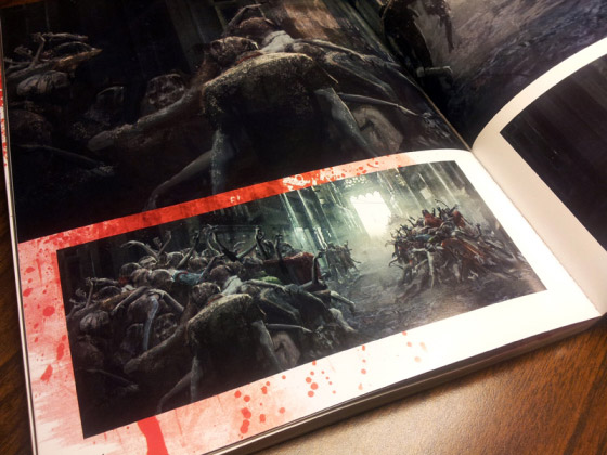
It’s a format that’s been used before with the Star Wars trilogy, a few Indiana Jones movies, and even Titanic, and it’s an interesting way to bring the script to life. Titan does a nice job of making it work here as an alternative to their standard format, with plenty of pictures, and a few side notes here and there from the director, Marc Forster, and a few other people from the production. I have to admit I didn’t read through the entire script, because I still haven’t seen the film, but intend to at some point, so I didn’t want to be spoiled too much. So while I can’t speak for the story (or the film, naturally), it does appear that the images and the text appear to be in sync pretty well, which is exactly what you want out of an illustrated screenplay.
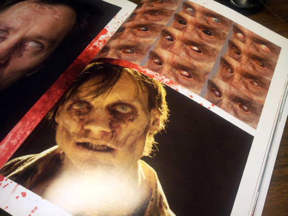
The closest we come to a standard Art of… book is near the end, starting with a gallery of zombie concept art including paintings and 3D models. This leads into a brief section on the design of improvised tools and weapons, and finally, photos from green screen shooting sessions. My only quibble with this presentation is a lack of text leaves us without much context for the artwork. A few thoughts are tossed out about the tools and weapons by the film’s weapons master, but for everything else we’re just sort of left to our own devices without any real insight into what we’re looking at, what the creators were trying to accomplish, or the evolution of the designs. Actually, most of the artwork isn’t even labeled, so it’s really just a collection of pretty paintings of zombies, some 3D models, and a bunch of people running in front of giant green walls. As someone who loves seeing the stages of the creative process, this was pretty disappointing.
Unfortunately, this one is a bit of a mixed bag for me. The book looks fantastic, with nice thick pages, good page layouts, and a really cool, textured cover. And the illustrated screenplay is a great way to show the synergy between the written word and the imagery of the film. But that relationship falters in the art gallery at the end of the book, as there’s little in the way of insight from the film production and the creative process. I applaud Titan for breaking the Art of… book mold, but they left out many of the elements that make the old tried-and-true format work so well. As the old saying goes, “If it ain’t broke, don’t fix it.”
World War Z: The Art of the Film is now available at Amazon and other fine bookstores.
