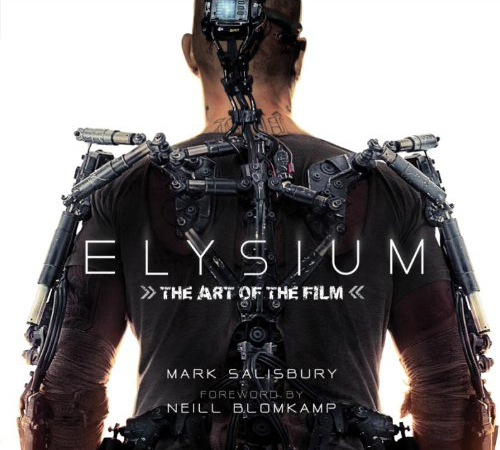
Book Review: The Art of Elysium
Posted 7 years ago by Rob Lammle Books

I really can’t get enough of concept art. I love to see the visual creative process put down on paper (literally or figuratively) in order to witness the evolution of an idea. It’s great to see the drastic changes in character appearances over time, but I even like to see how the little things were developed, like logos for fictional products. With that in mind, flipping through The Art of Elysium from Titan Books is like a concept art fan’s dream come true.
While he’s only directed two feature films, there’s no question that Neill Blomkamp has a certain aesthetic that he prefers. That gritty, makeshift look was first seen in the “prawn” camps of District 9, and it carries over to his latest film, Elysium, for scenes that take place on the ruined surface of the Earth. However, the design changes drastically on the eponymous orbital paradise, filled with the clean, smooth, surfaces that only 1960’s futurists could have envisioned. In order to create such contrast, Blomkamp brought on two impressive minds in production design – Art Director Phil Ivey, who previously worked on District 9 and The Lord of the Rings trilogy for WETA Workshop, as well as legendary concept artist Syd Mead, who brought us the worlds of Blade Runner and TRON.
