Book Review: The Art and Making of Hotel Transylvania
Posted 8 years ago by Rob Lammle Books, Uncategorized
When I was a kid, we had a Betamax copy of a making-of documentary that played on PBS just before Return of the Jedi debuted in theaters. I couldn’t tell you how many times I watched that tape, but I do know that when it was included on the DVD extras a few years back, the memories came flooding back. I can recall the early concept sculptures for Jabba the Hutt, where the could-have-been crimelord had four arms. There were drawings of long-legged, almost bird-like ewoks. And the early designs for the AT-ST (AKA “The Chicken Walker”) were just as cool as the final vehicle turned out to be. The show had a lasting impression on me because it showed me that there was a process to creating the iconic images I would grow to know and love. Since then, I have been obsessed with concept art for movies.
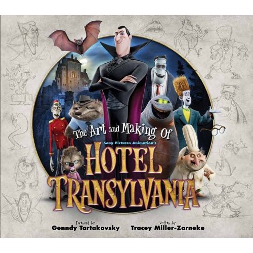
If you’ve read my review of Hotel Transylvania, I think it’s unlikely that the film will ever be considered as iconic as any of the Star Wars films (including the prequels), but that doesn’t mean that it was thrown together without any thought whatsoever. And thanks to The Art and Making of Hotel Transylvania from Titan Books, the most impressive part of this otherwise underwhelming film will not go unnoticed.

Some early designs for Dracula
After an introductory chapter, the first major section of the book is the character designs – one of my favorite parts of any concept art collection. For a movie like Hotel Transylvania, that features some of the best-known monsters in all of cinematic history – Dracula, Frankenstein, The Mummy, The Wolfman, etc. – it’s nice to see that the design team didn’t just rest on their laurels. They could have easily gone with some generic, tried-and-true depictions of these creatures of the night, but nearly every design is unique and wholly belongs to the world of this movie. Even the few times they took that iconic monster look, they tweaked it enough that it became their own.
For example, Eunice, Frankenstein’s wife, was conceived by designer Carter Goodrich as “a 1950s cocktail-hour gal, with quite a bit of sass in her.” To that end, Eunice looks like she’s been sewn together from various, ill-fitting bodyparts, and instead of the classic Bride of Frankenstein high-top fade, Eunice gets a big, Southern Beauty Pageant bouffant, with giant, gaudy earrings and too-long, sculptured nails. However, in keeping with the famous Bride’s look, she has a streak of white on one side. Again, original and interesting, but it still has those nods to the classic designs of old.
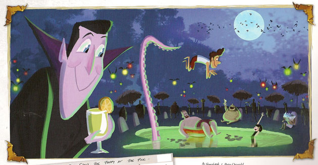
The book goes through every major character – and plenty of minor ones, too – to give us early concept sketches as well as more finalized designs. I especially loved the book’s willingness to show us characters that didn’t make the final cut for the film. For me, it’s always fascinating to think what could have been, and these give us that little glimpse.
Along with the concept sketches are some of the more technical art tools needed for animation. For example, storyboards showing how a scene was designed, as well as 360-degree rotations that are used as references for animators later on. There are even a few times, especially with the human villagers in the film, where the book shows how they can take the same basic CG character and mold it to look like a half-dozen different characters, allowing them to save on design time. It makes for an interesting look behind the scenes.
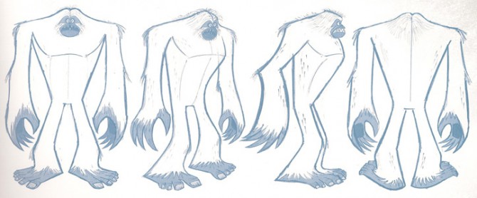
Of course I had to include a Sasquatch design!
After character designs, we have production design, which features some absolutely beautiful, frame-worthy artwork on display. From hand-painted landscape concepts to the development of the CG models that were later used in the film, you really get a feel for the immense amount of work that went into the making of the Hotel Transylvania world. The artists who populated the environment put just as much thought, time, and effort into designing a drafter’s table or a crib for a baby vampire as the people assigned to develop the look of the main characters. This section may not be as personable or identifiable as the character designs, but it’s no less important and fascinating, especially when you consider the level of detail the artists considered. It’s not unusual for every last detail to have been designed, planned, and animated, even if that detail is barely on screen.
Once again, the book highlights designs for places we see in the film, but it also places special emphasis on scenes that were cut entirely from the film during production. Perhaps one of the most beautiful is a part of the hotel grounds known simply as “The Ruins”, a place where Mavis goes when she wants to get away from her father’s overbearing gaze. The Ruins were ultimately cut from the film, but from the concept art and the description, it would have been a wonderful scene to witness.
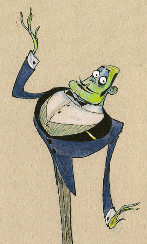
This zombie Maitre d’ didn’t even make it into the film, but he’s still awesome.
Aside from the amazing artwork from a wide variety of artists, the book also features plenty of behind-the-scenes anecdotes from director Tartakovsky, the concept artists themselves, as well as the CG animators who have to make all of these crazy designs work in a 3-dimensional space. It really is a great look into the making of the film.
As the old saying goes, the book is always better than the movie. In the case of The Art and Making of Hotel Transylvania, the old saying still stands. It’s almost a shame to see the amazing creativity and hours and hours of work that went into the making of a film when it wound up being sunk by a rather lackluster script.
Still, even if the final film might never inspire a future filmmaker, maybe the concept art presented here will.
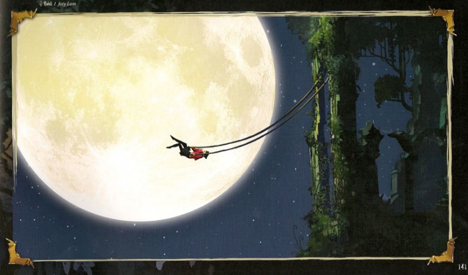
Mavis’ moonlit swing in The Ruins